by Ashley McNelis
——————–
Born in Brittany and raised in Florida, Pierre Le Hors is now based in New York. We met in his Greenpoint studio to discuss his work but ended up delving into the theoretical and practical complications of looking. In his varied photographic practice, Le Hors has transformed the concept of looking into a highly considered act. Viewing his work requires a certain concentration, as a steady focus enables a more in depth understanding and appreciation of the layered photographs. In the photographs and through the different means he uses to present them there are many factors and connections to uncover. Le Hors’s work is informed by a deep awareness of how we perceive images, whether it be in a gallery, in print or in the world. He has also become increasingly interested in how photographs and their meanings shift when presented differently. His practice concerns straight photography, the tactics of display, publications, technical experimentation, and, recently, an anonymous collaboration. He engages with a myriad of elements when thinking about how images come into being and turning those ideas into photographic objects.
——————–
Ashley McNelis How does the act of looking influence your practice? Specifically, what role does looking play in the work from your 2013 CCNY Darkroom Residency?
Pierre Le Hors Maybe I can address the second part of the question first. During that residency I started looking at arrangements of objects in art museums, and became aware of my own ambivalent relationship to the specificity of those objects. One of the places I focused on was the mezzanine in the American Wing at the Met, where glassware is displayed in tiered vitrines, and daylight streams in through the diagonal pane of windows along the north wall of the museum. My pictures there are an attempt to resolve that entire space as a terrain of shifting reflections, made up of multiple panes of glass that successively frame each other: the glass objects, the glass vitrines encasing those objects, and the glass wall encasing the vitrines. My own framing with the camera constitutes another layer, as does my arrangement of those pictures.
I think when we talk about looking, looking through a camera is always about framing or positioning oneself in relationship to the elements in the picture. I approached the museum environment foremost as a space designed for the experience of looking. The Met happens to have a particularly permissive policy with regards to photography, but otherwise I feel the work could equally well have been made elsewhere.
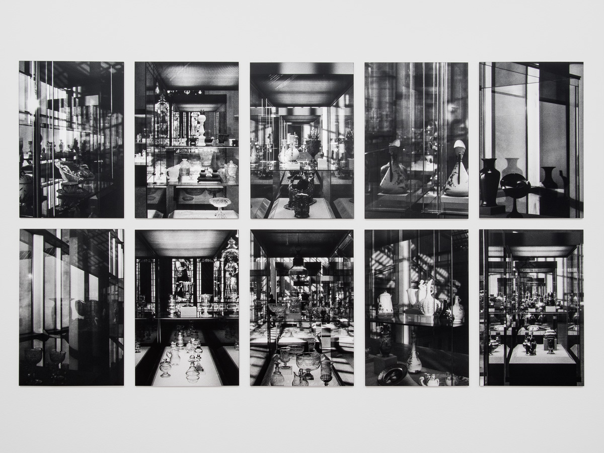
Pierre Le Hors, American Wing (1 – 10), 2014, 10 gelatin silver prints, each: 13.375 x 8.875 in., overall: 27.75 x 48.375 in.
AM What does the title of the subsequent exhibition, Period Act, refer to specifically?
PLH The title originated with the picture of a period room at the Brooklyn Museum, which feels rather like the backdrop of a Vermeer painting, or more accurately the set for the restaging of some imaginary Vermeer. It brought to mind the conditions that allowed me to even think of that room in those terms, its mediation through photography—meaning my picture of the room, and of course with the ubiquity of Vermeer, starting with the museum gift shop and on through ads for The Girl with the Pearl Earring.
The word Act is important because I want my images to actively enact rather than simply make reference to or recall something. I think there is a performative aspect of making images that goes beyond the somewhat limiting dialogue around photography’s self-reflexivity, digital versus analog processes, representation versus abstraction, and so on.
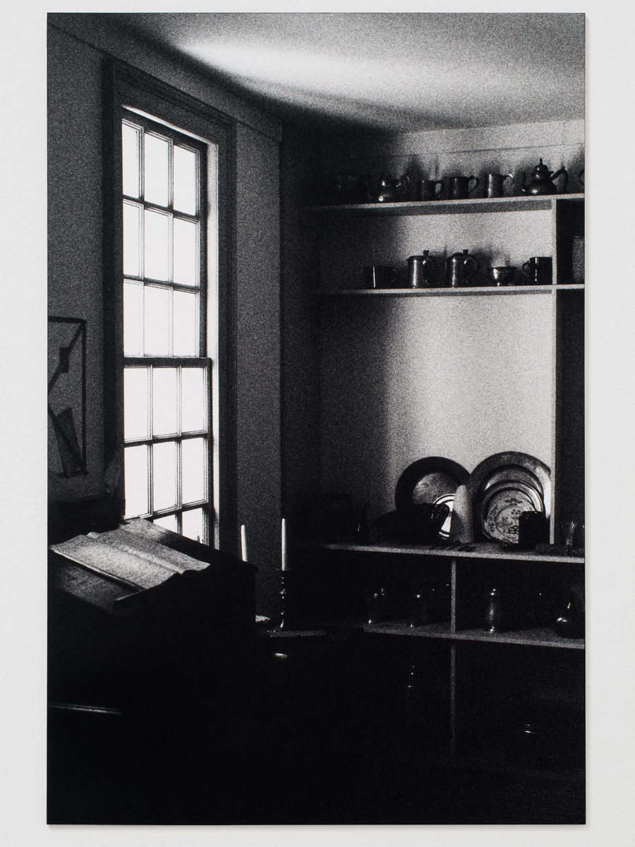
Pierre Le Hors, Vermeer, 2014, Gelatin silver print, 13.375 x 8.875 in.
AM What was your reasoning behind the exhibition layout? Can you tell me about the decision to juxtapose the silver gelatin prints with abstracted photograms?
PLH I wanted the photograms to act as a counterpoint to the black and white prints. In my mind, difference and contrast allow us to clarify the individual characteristics of a thing, to really see it for what it is. So in the show, the photograms are places of reflection, though at the same time their surface is impenetrable. It’s impossible for the eye to rest on any one point, so they deflect the gaze. In that sense they are total opposites of the black and whites. That opposition is very important to me, because it allows for dialogue and reflexivity. I’m not sure that either set of works could really stand on its own.
 Installation view: Pierre Le Hors, Period Act, The Camera Club of New York, March 19 – April 12, 2014
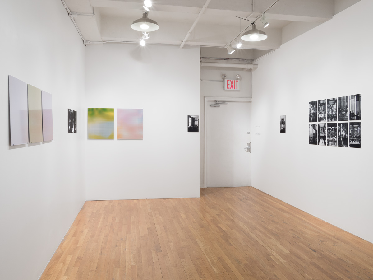
AM Does photography’s ability to explore surface and objecthood interest you?
PLH Sure. But I’m only interested in a surface insofar as it might lead somewhere else. For example, the way the photograms from Period Act are presented, leaning on pins against the wall, forces you to consider this flat piece of photo paper mounted on aluminum as an object. By placing them alongside the black and white prints (which are equally flat but flush to the wall), my hope is that they might allow the viewer to consider not only images themselves, but also the way they act. In other words, while the photograms might be ostensibly about surface, they are also spaces for reflection and reflexivity. Surface in and of itself doesn’t interest me, it’s pure appearance.
AM Can you tell me about the work that was featured in the 2014 VICE Photo Issue?
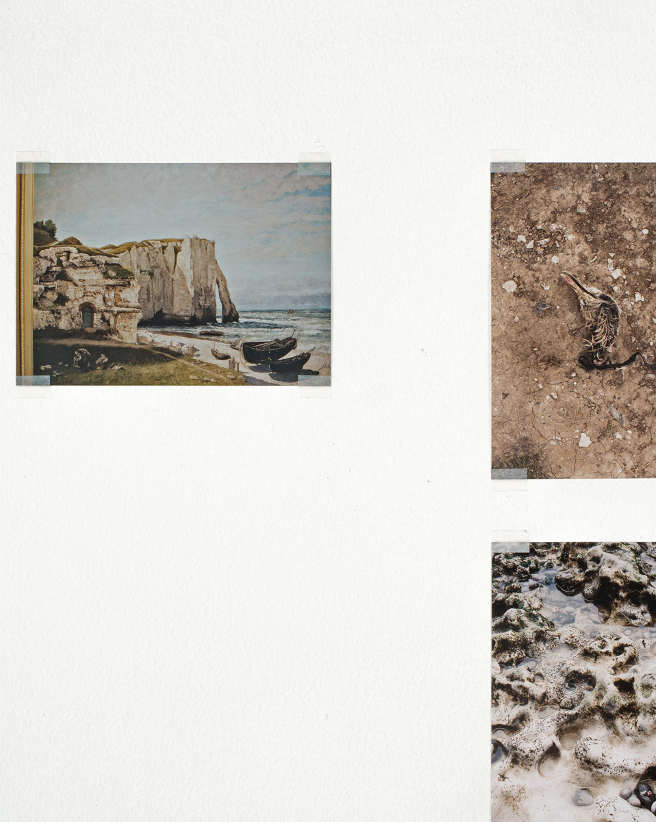
PLH The work in the magazine originated with a series of pictures I showed to VICE photo editor Matt Leifheit, a row of small lab prints I had taped up along the wall in my studio. Most of them were taken during a trip to France in 2012, shortly after I got married. I was visiting family in Normandy and Brittany, where I spent many summers as a kid. Others were taken in Florida, where I grew up. So most of these images evoke rather personal memories, which are tied up in those places, their specific climates, geography, their separation from each other and from me now.
For the magazine, Matt and I thought it might be best to reproduce the photographs as they were, meaning as prints taped up along a wall. I came up with a new arrangement to fit the dimensions of the page, and re-photographed the prints at a 1:1 scale—hence the connection to trompe l’oeil, which was the theme of the issue. This meant also that the space of the wall could “flow” horizontally from one page to the next, with certain images getting cut off on the edge of one page and continuing onto the next. I like how this simple device foregrounds the materiality of the magazine page, in relation to the spatial arrangement of the studio wall.
The title Atlantic Wall hints at another, more allegorical dimension of the wall, in relation to the content of the images. Incidentally, not long after I took those photos at Étretat, in Normandy, I happened upon this famous Courbet painting (La falaise d’Étretat après l’orage, 1870) at the Musée d’Orsay. I took a picture of the painting in the museum—the first image in the magazine—you see part of the museum frame in the magazine along the left side.
 Installation view: Trompe L’Oeil, Pioneer Works, New York, July 31 – August 10, 2014
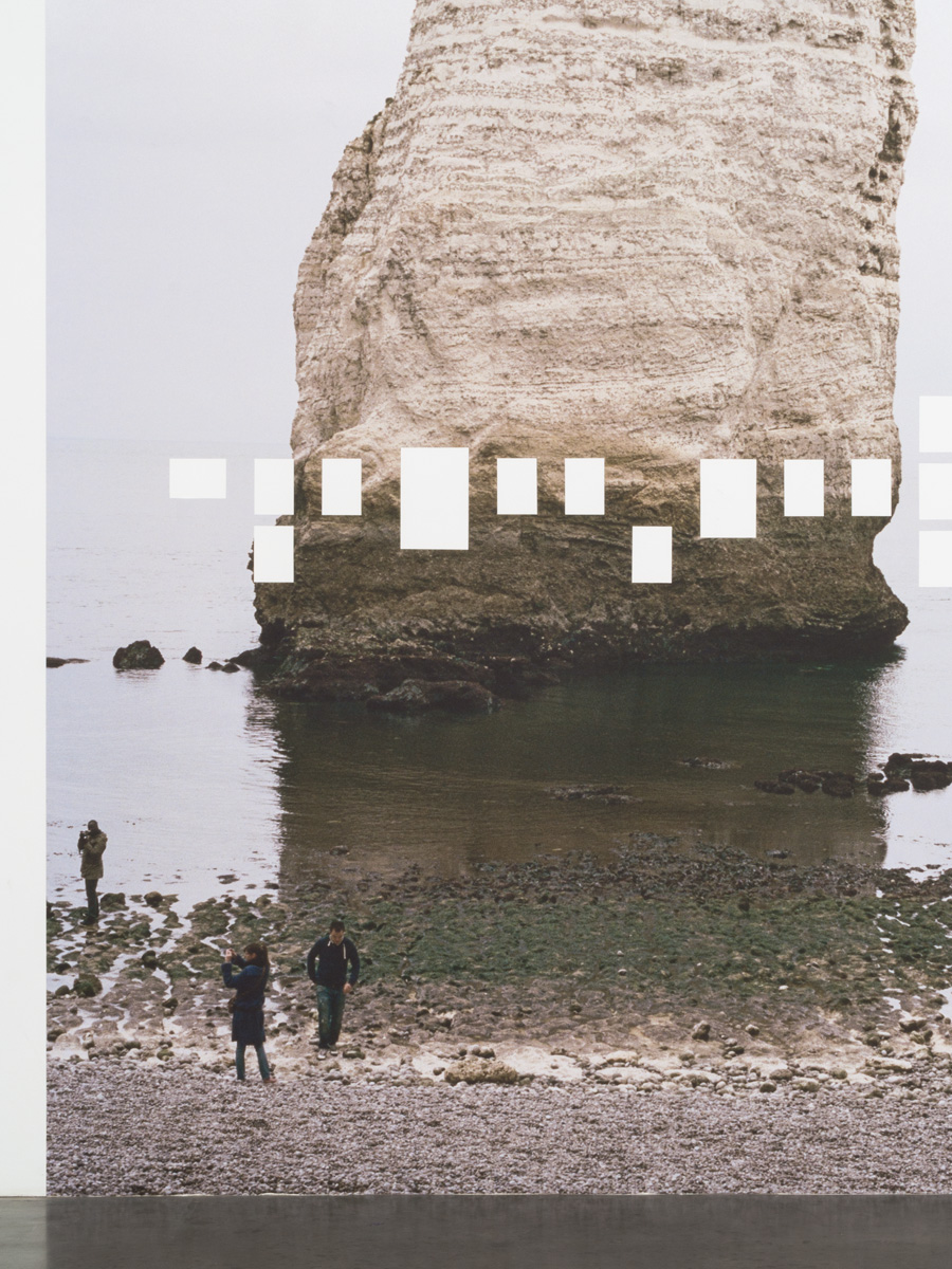
AM You enlarged and removed certain sections of the untitled photograph exhibited in the accompanying show, Trompe l’Oeil, when you translated it to the wall. How did you decide upon this method of display? How is it connected to the spread in the magazine?
PLH For the show, I enlarged one of the photos to fit the height of the gallery wall (12’6”). It’s a picture of a rock formation along the beach at Étretat. I then made a series of rectangular cuts in the print, sized and spaced to match the arrangement reproduced in VICE. The cutouts remove part of the image, revealing the gallery wall. My thinking was that it would be a kind of inversion of the previous arrangement, where the wall appears outside the boundaries of the images—though in the magazine, the wall is just another part of the photograph.
 Pierre Le Hors, Atlantic Wall, VICE Magazine Photo Issue 2014
AM How do you approach the process of making photography books or zines compared to making work to be exhibited on a gallery or museum wall?
PLH It’s a whole different set of concerns, obviously. Making publications for me has often been a collaborative process, and in that way I’ve managed to stay connected to a network of other artists, friends, and collaborators. They’ve always been made from modest means, born out of compromise and trial-and-error. I’ve had comparatively few opportunities for exhibitions, so I feel very fortunate that my work has found some life via the printed page.
AM Does this format allow you to experiment more?
PLH I don’t feel that books allow for any more experimentation than exhibitions do, per se. If anything they’re probably more limiting, because you have to work within a certain trim size, and what the materials and binding will allow. But having a set of restrictions is more productive than total freedom, anyway. My photos have always been pretty disparate and I think working with publications has been a way to sort through and make sense of them.
 Pierre Le Hors, Byways & Through Lines, 2013, 9.625 x 7 in., 44 pp., Published by Dashwood Books

AM Can you tell me about your NOWORK collaboration with your studio partner, Tuomas Korpijaakko?
PLH Tuomas and I met as classmates in the ICP-Bard MFA program, where we shared a studio. Since then we started NOWORK as an outlet for working with images and textual material taken around (or out of) the city. We all participate in the circulation and recirculation of images, and New York happens to be particularly fertile ground for that, as a site of both production and consumption. It’s a place that’s perpetually in flux, and as such it feels important to be able to mark the present moment. On a very basic level I want to stay connected to my surroundings, and one way to do that is to work with the material that I encounter on a daily basis: newspapers, bodega signage, ATM receipts, and so on.


NOWORK window installation, 5th Annual CCNY Zine & Self-Published Photo Book Fair, Foley Gallery, New York, September 12 – 14, 2014
AM Why did you two decide to keep NOWORK anonymous?
PLH Although it’s no secret that we’re behind it, the fact that we keep our projects authorless has allowed us a certain freedom in working with our material. I suppose there’s a kind of documentary impulse behind it—a conscious choice not to aestheticize or editorialize, but rather to re-present things from our environment as we found them—something an anthropologist might do for our present moment.
It’s a project that’s very much self-directed, meaning we’ve shied away from any kind of promotion, or push to get it “out there” as young artists are often encouraged to do. Somehow, through doing book fairs and distributing to a few shops, it’s found a way of working all on its own terms.
Ashley McNelis is a writer, curator and second year master’s student at the Institute of Fine Arts at New York University.
